Puwer Assessment Landing Page
The Challenge
The previous version of this landing page was converting at only 0.8% and the target for this redesigned page was to get it converting between 3% to 5%.
The Solution
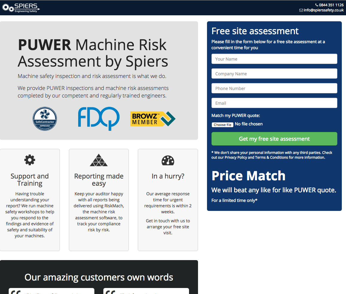
The make use of a 2nd column verticle form that sticks as the user scrolls down the page. The use of bright colour behind the form is used to draw the eye over the to form and offers a free assesment to entice the user to fill in the form.
Have a look at the finished page
Landing page redesign to improve conversion rates
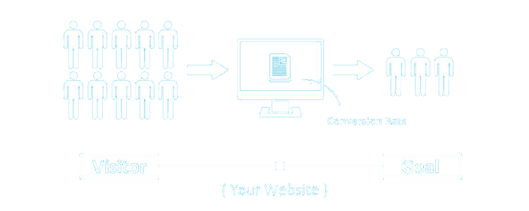
What is a conversion rate?
Simply put a conversion rate is a calculation between the number of visitors to a page compared to the number of visitors doing an action, otherwise known as a goal. Your goal can be set to anything such as filling in a form, clicking a download link or purchasing a product.
How to improve conversion rate
There are many factors that can improve conversion rates as you are dealing with humans, this can be from layout, to use of colours to pyscological triggers like FOMO (fear of missing out). In this case we decided a fixed sidebar form due to it’s a long page and use colour to draw the eye to the form.